


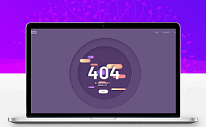
紫色动态特效404错误页网站源码。
源码展示
<!DOCTYPE html>
<html>
<head>
<meta charset="utf-8">
<title></title>
<style type="text/css">
@import url("https://fonts.googleapis.com/css?family=Barlow+Condensed:300,400,500,600,700,800,900|Barlow:300,400,500,600,700,800,900&display=swap");
.about {
position: fixed;
z-index: 10;
bottom: 10px;
right: 10px;
width: 40px;
height: 40px;
display: flex;
justify-content: flex-end;
align-items: flex-end;
transition: all 0.2s ease;
}
.about .bg_links {
width: 40px;
height: 40px;
border-radius: 100%;
display: flex;
justify-content: center;
align-items: center;
background-color: rgba(0, 0, 0, 0.2);
border-radius: 100%;
backdrop-filter: blur(5px);
position: absolute;
}
.about .logo {
width: 40px;
height: 40px;
z-index: 9;
background-size: 50%;
background-repeat: no-repeat;
background-position: 10px 7px;
opacity: 0.9;
transition: all 1s 0.2s ease;
bottom: 0;
right: 0;
}
.about .social {
opacity: 0;
right: 0;
bottom: 0;
}
.about .social .icon {
width: 100%;
height: 100%;
background-size: 20px;
background-repeat: no-repeat;
background-position: center;
background-color: transparent;
display: flex;
transition: all 0.2s ease, background-color 0.4s ease;
opacity: 0;
border-radius: 100%;
}
.about .social.portfolio {
transition: all 0.8s ease;
}
.about .social.portfolio .icon {}
.about .social.dribbble {
transition: all 0.3s ease;
}
.about .social.dribbble .icon {}
.about .social.linkedin {
transition: all 0.8s ease;
}
.about .social.linkedin .icon {}
.about:hover {
width: 105px;
height: 105px;
transition: all 0.6s cubic-bezier(0.64, 0.01, 0.07, 1.65);
}
.about:hover .logo {
opacity: 1;
transition: all 0.6s ease;
}
.about:hover .social {
opacity: 1;
}
.about:hover .social .icon {
opacity: 0.9;
}
.about:hover .social:hover {
background-size: 28px;
}
.about:hover .social:hover .icon {
background-size: 65%;
opacity: 1;
}
.about:hover .social.portfolio {
right: 0;
bottom: calc(100% - 40px);
transition: all 0.3s 0s cubic-bezier(0.64, 0.01, 0.07, 1.65);
}
.about:hover .social.portfolio .icon:hover {
background-color: #698fb7;
}
.about:hover .social.dribbble {
bottom: 45%;
right: 45%;
transition: all 0.3s 0.15s cubic-bezier(0.64, 0.01, 0.07, 1.65);
}
.about:hover .social.dribbble .icon:hover {
background-color: #ea4c89;
}
.about:hover .social.linkedin {
bottom: 0;
right: calc(100% - 40px);
transition: all 0.3s 0.25s cubic-bezier(0.64, 0.01, 0.07, 1.65);
}
.about:hover .social.linkedin .icon:hover {
background-color: #0077b5;
}
h1,
h2,
h3,
h4,
h5,
h6,
p,
ul,
li,
button,
a,
i,
input,
body {
margin: 0;
padding: 0;
list-style: none;
border: 0;
-webkit-tap-highlight-color: transparent;
text-decoration: none;
color: inherit;
}
h1:focus,
h2:focus,
h3:focus,
h4:focus,
h5:focus,
h6:focus,
p:focus,
ul:focus,
li:focus,
button:focus,
a:focus,
i:focus,
input:focus,
body:focus {
outline: 0;
}
body {
margin: 0;
padding: 0;
height: auto;
font-family: "Barlow", sans-serif;
background: #695681;
}
.logo {
position: fixed;
z-index: 5;
bottom: 10px;
right: 10px;
width: 40px;
height: 40px;
border-radius: 100%;
display: flex;
justify-content: center;
align-items: center;
background: rgba(0, 0, 0, 0.1);
border-radius: 100%;
backdrop-filter: blur(5px);
}
.logo img {
width: 55%;
height: 55%;
transform: translateY(-1px);
opacity: 0.8;
}
nav .menu {
width: 100%;
height: 80px;
position: absolute;
display: flex;
align-items: center;
justify-content: space-between;
padding: 0 5%;
box-sizing: border-box;
z-index: 3;
}
nav .menu .website_name {
color: #695681;
font-weight: 600;
font-size: 20px;
letter-spacing: 1px;
background: white;
padding: 4px 8px;
border-radius: 2px;
opacity: 0.5;
transition: all 0.4s ease;
cursor: pointer;
}
nav .menu .website_name:hover {
opacity: 1;
}
nav .menu .menu_links {
transition: all 0.4s ease;
opacity: 0.5;
}
nav .menu .menu_links:hover {
opacity: 1;
}
@media screen and (max-width: 799px) {
nav .menu .menu_links {
display: none;
}
}
nav .menu .menu_links .link {
color: white;
text-transform: uppercase;
font-weight: 500;
margin-right: 50px;
letter-spacing: 2px;
position: relative;
transition: all 0.3s 0.2s ease;
}
nav .menu .menu_links .link:last-child {
margin-right: 0;
}
nav .menu .menu_links .link:before {
content: "";
position: absolute;
width: 0px;
height: 4px;
background: linear-gradient(90deg, #FFEDC0 0%, #FF9D87 100%);
bottom: -10px;
border-radius: 4px;
transition: all 0.4s cubic-bezier(0.82, 0.02, 0.13, 1.26);
left: 100%;
}
nav .menu .menu_links .link:hover {
opacity: 1;
color: #FB8A8A;
}
nav .menu .menu_links .link:hover:before {
width: 40px;
left: 0;
}
nav .menu .menu_icon {
width: 40px;
height: 40px;
position: relative;
display: none;
justify-content: center;
align-items: center;
cursor: pointer;
}
@media screen and (max-width: 799px) {
nav .menu .menu_icon {
display: flex;
}
}
nav .menu .menu_icon .icon {
width: 24px;
height: 2px;
background: white;
position: absolute;
}
nav .menu .menu_icon .icon:before,
nav .menu .menu_icon .icon:after {
content: "";
width: 100%;
height: 100%;
background: inherit;
position: absolute;
transition: all 0.3s cubic-bezier(0.49, 0.04, 0, 1.55);
}
nav .menu .menu_icon .icon:before {
transform: translateY(-8px);
}
nav .menu .menu_icon .icon:after {
transform: translateY(8px);
}
nav .menu .menu_icon:hover .icon {
background: #FFEDC0;
}
nav .menu .menu_icon:hover .icon:before {
transform: translateY(-10px);
}
nav .menu .menu_icon:hover .icon:after {
transform: translateY(10px);
}
.wrapper {
display: grid;
grid-template-columns: 1fr;
justify-content: center;
align-items: center;
height: 100vh;
overflow-x: hidden;
}
.wrapper .container {
margin: 0 auto;
transition: all 0.4s ease;
display: flex;
justify-content: center;
align-items: center;
position: relative;
}
.wrapper .container .scene {
position: absolute;
width: 100vw;
height: 100vh;
vertical-align: middle;
}
.wrapper .container .one,
.wrapper .container .two,
.wrapper .container .three,
.wrapper .container .circle,
.wrapper .container .p404 {
width: 60%;
height: 60%;
top: 20% !important;
left: 20% !important;
min-width: 400px;
min-height: 400px;
}
.wrapper .container .one .content,
.wrapper .container .two .content,
.wrapper .container .three .content,
.wrapper .container .circle .content,
.wrapper .container .p404 .content {
width: 600px;
height: 600px;
display: flex;
justify-content: center;
align-items: center;
position: absolute;
top: 50%;
left: 50%;
transform: translate(-50%, -50%);
animation: content 0.8s cubic-bezier(1, 0.06, 0.25, 1) backwards;
}
@keyframes content {
0% {
width: 0;
}
}
.wrapper .container .one .content .piece,
.wrapper .container .two .content .piece,
.wrapper .container .three .content .piece,
.wrapper .container .circle .content .piece,
.wrapper .container .p404 .content .piece {
width: 200px;
height: 80px;
display: flex;
position: absolute;
border-radius: 80px;
z-index: 1;
animation: pieceLeft 8s cubic-bezier(1, 0.06, 0.25, 1) infinite both;
}
@keyframes pieceLeft {
50% {
left: 80%;
width: 10%;
}
}
@keyframes pieceRight {
50% {
right: 80%;
width: 10%;
}
}
@media screen and (max-width: 799px) {
.wrapper .container .one,
.wrapper .container .two,
.wrapper .container .three,
.wrapper .container .circle,
.wrapper .container .p404 {
width: 90%;
height: 90%;
top: 5% !important;
left: 5% !important;
min-width: 280px;
min-height: 280px;
}
}
@media screen and (max-height: 660px) {
.wrapper .container .one,
.wrapper .container .two,
.wrapper .container .three,
.wrapper .container .circle,
.wrapper .container .p404 {
min-width: 280px;
min-height: 280px;
width: 60%;
height: 60%;
top: 20% !important;
left: 20% !important;
}
}
.wrapper .container .text {
width: 60%;
height: 40%;
min-width: 400px;
min-height: 500px;
position: absolute;
margin: 40px 0;
animation: text 0.6s 1.8s ease backwards;
}
@keyframes text {
0% {
opacity: 0;
transform: translateY(40px);
}
}
@media screen and (max-width: 799px) {
.wrapper .container .text {
min-height: 400px;
height: 80%;
}
}
.wrapper .container .text article {
width: 400px;
position: absolute;
bottom: 0;
z-index: 4;
display: flex;
flex-direction: column;
justify-content: center;
align-items: center;
text-align: center;
bottom: 0;
left: 50%;
transform: translateX(-50%);
}
@media screen and (max-width: 799px) {
.wrapper .container .text article {
width: 100%;
}
}
.wrapper .container .text article p {
color: white;
font-size: 18px;
letter-spacing: 0.6px;
margin-bottom: 40px;
text-shadow: 6px 6px 10px #32243E;
}
.wrapper .container .text article button {
height: 40px;
padding: 0 30px;
border-radius: 50px;
cursor: pointer;
box-shadow: 0px 15px 20px rgba(54, 24, 79, 0.5);
z-index: 3;
color: #695681;
background-color: white;
text-transform: uppercase;
font-weight: 600;
font-size: 12px;
transition: all 0.3s ease;
}
.wrapper .container .text article button:hover {
box-shadow: 0px 10px 10px -10px rgba(54, 24, 79, 0.5);
transform: translateY(5px);
background: #FB8A8A;
color: white;
}
.wrapper .container .p404 {
font-size: 200px;
font-weight: 700;
letter-spacing: 4px;
color: white;
display: flex !important;
justify-content: center;
align-items: center;
position: absolute;
z-index: 2;
animation: anime404 0.6s cubic-bezier(0.3, 0.8, 1, 1.05) both;
animation-delay: 1.2s;
}
@media screen and (max-width: 799px) {
.wrapper .container .p404 {
font-size: 100px;
}
}
@keyframes anime404 {
0% {
opacity: 0;
transform: scale(10) skew(20deg, 20deg);
}
}
.wrapper .container .p404:nth-of-type(2) {
color: #36184F;
z-index: 1;
animation-delay: 1s;
filter: blur(10px);
opacity: 0.8;
}
.wrapper .container .circle {
position: absolute;
}
.wrapper .container .circle:before {
content: "";
position: absolute;
width: 800px;
height: 800px;
background-color: rgba(54, 24, 79, 0.2);
border-radius: 100%;
top: 50%;
left: 50%;
transform: translate(-50%, -50%);
box-shadow: inset 5px 20px 40px rgba(54, 24, 79, 0.25), inset 5px 0px 5px rgba(50, 36, 62, 0.3), inset 5px 5px 20px rgba(50, 36, 62, 0.25), 2px 2px 5px rgba(255, 255, 255, 0.2);
animation: circle 0.8s cubic-bezier(1, 0.06, 0.25, 1) backwards;
}
@keyframes circle {
0% {
width: 0;
height: 0;
}
}
@media screen and (max-width: 799px) {
.wrapper .container .circle:before {
width: 400px;
height: 400px;
}
}
.wrapper .container .one .content:before {
content: "";
position: absolute;
width: 600px;
height: 600px;
background-color: rgba(54, 24, 79, 0.3);
border-radius: 100%;
box-shadow: inset 5px 20px 40px rgba(54, 24, 79, 0.25), inset 5px 0px 5px rgba(50, 36, 62, 0.3), inset 5px 5px 20px rgba(50, 36, 62, 0.25), 2px 2px 5px rgba(255, 255, 255, 0.2);
animation: circle 0.8s 0.4s cubic-bezier(1, 0.06, 0.25, 1) backwards;
}
@media screen and (max-width: 799px) {
.wrapper .container .one .content:before {
width: 300px;
height: 300px;
}
}
.wrapper .container .one .content .piece {
background: linear-gradient(90deg, #8077EA 13.7%, #EB73FF 94.65%);
}
.wrapper .container .one .content .piece:nth-child(1) {
right: 15%;
top: 18%;
height: 30px;
width: 120px;
animation-delay: 0.5s;
animation-name: pieceRight;
}
.wrapper .container .one .content .piece:nth-child(2) {
left: 15%;
top: 45%;
width: 150px;
height: 50px;
animation-delay: 1s;
animation-name: pieceLeft;
}
.wrapper .container .one .content .piece:nth-child(3) {
left: 10%;
top: 75%;
height: 20px;
width: 70px;
animation-delay: 1.5s;
animation-name: pieceLeft;
}
.wrapper .container .two .content .piece {
background: linear-gradient(90deg, #FFEDC0 0%, #FF9D87 100%);
}
.wrapper .container .two .content .piece:nth-child(1) {
left: 0%;
top: 25%;
height: 40px;
width: 120px;
animation-delay: 2s;
animation-name: pieceLeft;
}
.wrapper .container .two .content .piece:nth-child(2) {
right: 15%;
top: 35%;
width: 180px;
height: 50px;
animation-delay: 2.5s;
animation-name: pieceRight;
}
.wrapper .container .two .content .piece:nth-child(3) {
right: 10%;
top: 80%;
height: 20px;
width: 160px;
animation-delay: 3s;
animation-name: pieceRight;
}
.wrapper .container .three .content .piece {
background: #FB8A8A;
}
.wrapper .container .three .content .piece:nth-child(1) {
left: 25%;
top: 35%;
height: 20px;
width: 80px;
animation-name: pieceLeft;
animation-delay: 3.5s;
}
.wrapper .container .three .content .piece:nth-child(2) {
right: 10%;
top: 55%;
width: 140px;
height: 40px;
animation-name: pieceRight;
animation-delay: 4s;
}
.wrapper .container .three .content .piece:nth-child(3) {
left: 40%;
top: 68%;
height: 20px;
width: 80px;
animation-name: pieceLeft;
animation-delay: 4.5s;
}
</style>
</head>
<body>
<script src="https://cdn.staticfile.net/parallax/3.1.0/parallax.min.js"></script>
<div class="about">
<a class="bg_links social portfolio" href="#" rel="external nofollow" rel="external nofollow" rel="external nofollow" rel="external nofollow" rel="external nofollow" rel="external nofollow" >
<span class="icon"></span>
</a>
<a class="bg_links social dribbble" href="#" rel="external nofollow" rel="external nofollow" rel="external nofollow" rel="external nofollow" rel="external nofollow" rel="external nofollow" >
<span class="icon"></span>
</a>
<a class="bg_links social linkedin" href="#" rel="external nofollow" rel="external nofollow" rel="external nofollow" rel="external nofollow" rel="external nofollow" rel="external nofollow" >
<span class="icon"></span>
</a>
<a class="bg_links logo"></a>
</div>
<nav>
<div class="menu">
<p class="website_name">浩沐资源网</p>
<div class="menu_links">
<a href="#" rel="external nofollow" rel="external nofollow" rel="external nofollow" rel="external nofollow" rel="external nofollow" rel="external nofollow" class="link">首页</a>
<a href="#" rel="external nofollow" rel="external nofollow" rel="external nofollow" rel="external nofollow" rel="external nofollow" rel="external nofollow" class="link">联系我们</a>
<a href="#" rel="external nofollow" rel="external nofollow" rel="external nofollow" rel="external nofollow" rel="external nofollow" rel="external nofollow" class="link">关于我们</a>
</div>
<div class="menu_icon">
<span class="icon"></span>
</div>
</div>
</nav>
<section class="wrapper">
<div class="container">
<div id="scene" class="scene" data-hover-only="false">
<div class="circle" data-depth="1.2"></div>
<div class="one" data-depth="0.9">
<div class="content">
<span class="piece"></span>
<span class="piece"></span>
<span class="piece"></span>
</div>
</div>
<div class="two" data-depth="0.60">
<div class="content">
<span class="piece"></span>
<span class="piece"></span>
<span class="piece"></span>
</div>
</div>
<div class="three" data-depth="0.40">
<div class="content">
<span class="piece"></span>
<span class="piece"></span>
<span class="piece"></span>
</div>
</div>
<p class="p404" data-depth="0.50">404</p>
<p class="p404" data-depth="0.10">404</p>
</div>
<div class="text">
<article>
<p>哦!看起来你迷路了! <br>请返回主页!</p>
<button>i dare!</button>
</article>
</div>
</div>
</section>
<script type="text/javascript">
// Parallax Code
var scene = document.getElementById('scene');
var parallax = new Parallax(scene);
</script>
</body>
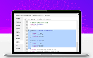
</html>源码截图


